Website Design Agency Calgary
Your website is the digital front door to your business, and we’re here to make it shine. In today’s world, an engaging, responsive website isn’t just a nice-to-have—it’s essential. A user-friendly, well-designed site builds trust, ensures customers find what they need, and keeps them coming back. While we specialize in WordPress, we also build on other top platforms to best meet your business goals and give you the flexibility you need.
Website Design And Development Calgary
The right web pages for your audience — every time.
Today it’s not enough to simply get someone to visit your website, especially in Calgary. Visitors need to understand what you’re all about within seconds of landing on your web pages — whether it’s your home page or landing pages for your digital ad campaigns. That means great website design is everything for your business. That’s where we come in.
Our Calgary web design team specializes in creating impactful, responsive website design solutions with exceptional user experience. It’s beyond just a “good” first impression. As a leading website design company Calgary businesses trust, we help you quickly showcase what your business is about, so visitors instantly know who you are and what you offer.
Through expert website development in Calgary, we’ll work to best understand your audience, ensuring there’s never any doubt that the first click was the best decision they ever made. Our web design company expertise guides them exactly where they need to go – to your services, products, or contact information.
With our website design Calgary services, we create digital experiences that not only look professional but convert visitors into customers. Contact Calgary’s premier web design company today to transform your online presence.
OUR TRIED AND TESTED WEBSITE DESIGN PROCESS
Website design process
01
Planning Your New Website
We start with a planning session led by a project manager who oversees every aspect of your website’s design and development. Your input drives the process, but if you’re not sure where to start, don’t worry—we know how to bring your brand to life. Our team crafts a customized plan based on your goals, focusing on performance, messaging, and conversion optimization to create a website that’s built to succeed.
02
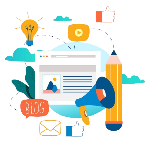
High-Quality Website Content
Web content needs an occasional refresh to stay relevant and keep Google’s algorithms working for you. Our team updates and optimizes your content so visitors find exactly what they’re looking for—fast. High-quality, SEO-optimized content doesn’t just help you rank; it also drives conversions and enhances the user experience.
03
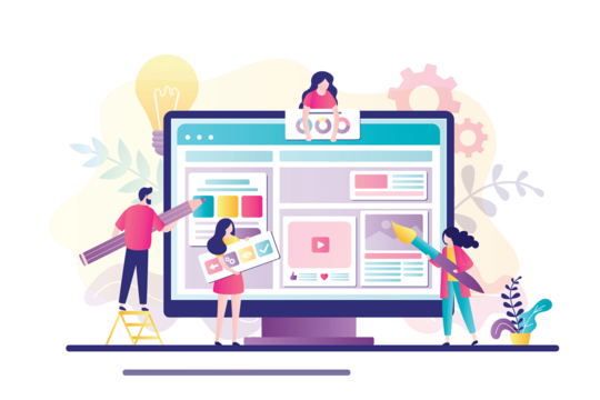
Eye-Catching, Creative Designs
We build your website with a sharp eye on what your audience wants and what your competition is doing, ensuring you stand out. And don’t worry—you’re involved at every step, so your brand vision shines through. We create a fully responsive website that looks fantastic on desktops, tablets, and mobiles, using design best practices to maintain a consistent brand look and feel.
04
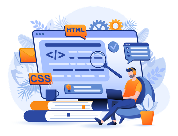
Website Development
Our development process is focused on driving traffic and encouraging visitors to take action. With quick load times, clear navigation, and seamless functionality, your website offers a smooth, engaging experience. From the moment visitors arrive, they’re guided through your content with ease, helping them connect with your brand and take that next step.
Stunning Website Design in Calgary to Elevate Your Brand
Your Website is Your Marketing Foundation
Investing in Digital Marketing without having a great website will result in lost time, lost revenue, and poor brand perception. A strong website serves as the cornerstone of your entire digital presence, establishing credibility and converting visitors into customers before your other marketing efforts can take effect.
When potential customers discover your business through social media, email campaigns, or search ads, they inevitably visit your website to learn more. If they encounter an outdated design, slow loading times, or confusing navigation, they’ll quickly bounce to a competitor – wasting your marketing investment and damaging your brand reputation.
Turn your potential into achievement with our help
Frequently Asked Website Design Questions
Professional website design delivers significant advantages compared to templates from page builders or amateur agencies. Our expert designers craft custom websites that create strong, positive first impressions, deliver smooth user experiences, reflect your brand identity perfectly, and enhance your search engine optimization efforts.
When visitors encounter a professionally designed website, they immediately form positive perceptions of your business. Our custom designs ensure intuitive navigation, consistent branding, and technical excellence that template solutions simply can't match. This professional approach not only improves visitor engagement but also strengthens your online presence through proper SEO implementation.
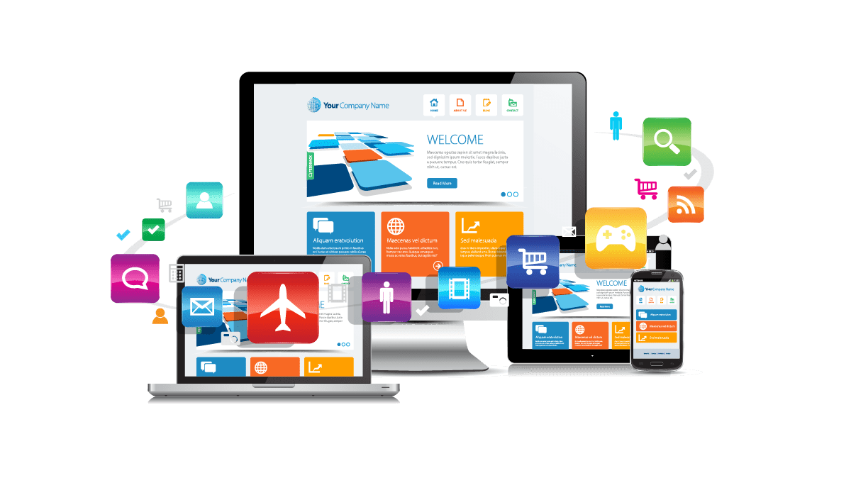
Responsive web design is the approach that ensures a website looks and flows well on different screen sizes and devices. At Branding Buzz Marketing, we aim to provide an optimal viewing and user experience across a wide range of platforms, especially since an average of 55% of all traffic comes from mobile devices. Responsive design involves using flexible grid layouts, fluid images, and CSS media queries to automatically adjust the design elements, font sizes, and content positioning.
This adaptation capability is crucial in today's multi-device world, where users might view your site on anything from a small smartphone to a large desktop monitor. By implementing responsive design principles, we create websites that maintain their functionality and visual appeal regardless of how they're accessed. This approach not only improves user satisfaction but also supports better search engine rankings, as search engines favor mobile-friendly websites.
Absolutely! We specialize in website redesigns and can tailor the scope to fit your needs. Whether you need a full revamp, a complete rebrand, or just minor upgrades and optimizations, we’ll ensure your website is modern, user-friendly, and aligned with your industry standards. Let’s create a site that truly represents your brand! 🚀